Scoreboard-Style Graphics on Mobile: Making Clean Match Visuals for Social Posts
Cricket updates move fast, and social feeds reward visuals that communicate the score in a second. A clean scoreboard-style graphic does exactly that. It looks intentional, stays readable on small screens, and works for stories, reels covers, and feed posts. For an audience that follows Lightroom-style mobile editing, the process fits naturally: start with a strong base, keep the look consistent, and export clean.
Start the design with a reliable score reference
Accurate numbers are the foundation. A dedicated live-score page helps creators update graphics without jumping across multiple sources, especially during tight moments like power plays or the final overs. This is also where match rhythm becomes easier to follow, because the score check is quick and repeatable as the design gets updated.
A smooth workflow uses a single reference during the match, then updates the graphic as needed while keeping the layout unchanged. That becomes much easier with the score reference already open in the browser and checked from the same place every time—such as on live criket score – before the updated numbers are dropped into the template and exported.
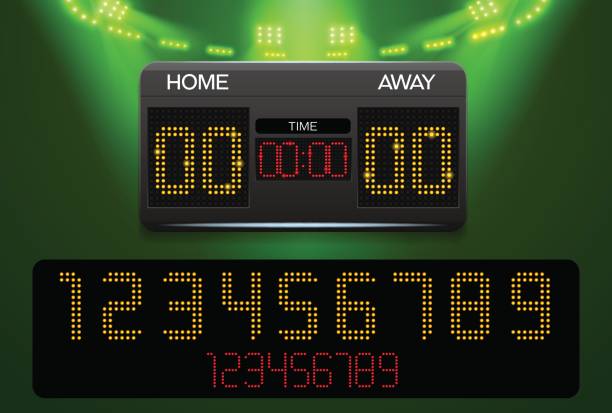
Make the layout easy to read on a phone
A scoreboard graphic succeeds when it respects the way people scroll. Text must be large enough, spacing must be generous, and the hierarchy must feel obvious. Team names should sit at the top of the block, the score line should feel like the headline, and overs should read as a supporting detail.
A common mistake is cramming too much into one card. On mobile, less information usually reads better. If the match needs extra context, that can go into the caption rather than the image. The graphic’s job is to deliver the score cleanly and quickly.
One simple checklist for building a clean scoreboard graphic
- Pick a social-ready canvas size first, then design around it (1080 × 1920 for stories or 1080 × 1350 for feed posts).
- Keep the scoreboard in the center area and leave generous top and bottom margins so platform overlays do not cover the text.
- Use two font sizes plus a smaller label size, and keep the score line the most prominent element.
- Choose one accent color for a divider, badge, or overs label and keep everything else neutral.
- Use a background that supports the text: a soft gradient, a blurred match photo, or a flat color with light texture.
- Export in high quality so the type stays sharp, then post using the platform’s normal upload flow.
Build backgrounds that feel polished, not busy
A match photo can add energy, yet it should not compete with the numbers. The simplest way to solve that is to push the photo into the background. Lowering detail and softening contrast helps because it creates separation between text and image. A gentle vignette also keeps attention around the scoreboard block.
When the background is calm, even a simple scoreboard feels “designed.” That matters on pages that share many updates in one day, because viewers recognize the style immediately and know where to look for the score.
Keep the style consistent across the whole match
A match day usually creates multiple posts: toss, early overs, innings break, chase updates, and final result. Consistency makes the set look clean. The easiest approach is to lock a template: same spacing, same font pairing, same accent color, and the same background treatment.
This is where Lightroom-style habits help. Mobile editors also use repeatable settings or preset-like adjustments to have consistent aesthetics among several images. The same would work here: apply the same treatment each time, so the only thing that changes is the score.
Add small details that improve clarity
Scoreboard graphics look more professional when alignment is neat, and labels stay short. Overs should be formatted the same way each time. Team abbreviations should not change mid-thread. Line spacing should give the score room to breathe.
Text clarity also depends on export choices. Keeping the design at 1080 pixels wide helps because social platforms handle that size well. Crisp type often looks better with a PNG export, especially when the background includes gradients.
Final takeaway
A good scoreboard-style graphic is built for speed and readability: accurate numbers, a clear hierarchy, and a calm background that keeps the score front and center. With a stable template, updates become easy—check the score, swap the numbers, export, and post. That repeatable rhythm is exactly what makes mobile match visuals feel clean and professional across an entire game.
